Showing posts with label Investing. Show all posts

Sunday 1 November 2020

All weather portfolio

The All Weather Portfolio was the brainchild of Ray Dalio and his pals at Bridgewater which was eventually put to use in the 1990's. The history behind their thinking can be found here. As the name suggests the idea behind the portfolio construction was to build a fund that could generate returns in any economic environment. And looking at some basic stats it has done just that, and has a CAGR of around 7% since 2007.

The foundation of the portfolio was the notion that there are a limited number of factors driving returns in various asset classes. This was boiled down to 4 economic environments, a growing or shrinking economy, and rising or falling inflation as shown below:


And the idea that various asset classes outperformed in those different growth and/ or inflation environments:


However it wasn't simply a judgement of where to find the best returns, the All Weather portfolio was a risk parity portfolio. To this end the construction of the portfolio was designed such that each asset class was limited to the same amount of risk. Using the 4 environments above the portfolio was built such that there was an equal risk distributed across the different environments and the returns that each asset class would provide.

Risk, as I discussed in a previous post is a slippery notion in investing. But within the context of the All Weather portfolio, risk is viewed as volatility, and the portfolio is designed to reduce this whilst maintaining a steady return.

The exact contents of the Bridgewater portfolio is understandably kept under wraps. However, in an interview with self-help guru Tony Robbins, Dalio revealed the outline of the fund. It is roughly:

  • 40% long-term bonds
  • 30% stocks
  • 15% intermediate-term bonds
  • 7.5% gold
  • 7.5% commodities

So armed with this information, using readily available investments one could recreate an approximation of the Bridgewater All Weather portfolio. And using the excellent portfoliovizualiser site, as noted above, we can see that using the above allocations, the portfolio seems to have performed pretty well, generating a reasonable 7% CAGR with a relatively low degree of volatility.

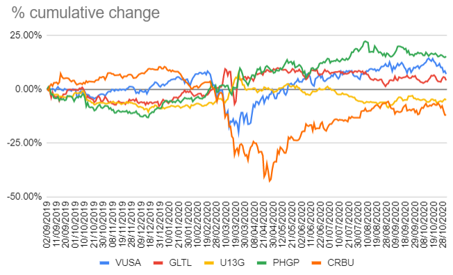
I decided to play around in googlesheets to try out a version of the portfolio with a few funds that seemed to cover off the main asset classes:

  • 40% long-term bonds: SPDR Barclays 15+ Year Gilt UCITS ETF (GLTL)
  • 30% stocks: S&P 500 UCITS ETF (VUSA)
  • 15% intermediate-term bonds: Lyxor iBoxx $ Treasuries 1-3yr UCITS ETF (U13G)
  • 7.5% gold: WisdomTree Physical Gold (PHGP)
  • 7.5% commodities: Lyxor Commodities Thomson Reuters/CoreCommodity CRB (CRBU)

Feel free to download a copy of the spreadsheet and play around with the funds. I've not spent a lot of time trying to pick the best or cheapest funds so there may well be better alternatives out there.

One of the attractions of the portfolio is that it removes the need for market timing, whenever you start should make no difference. So I took data from around a year ago, as this would include the bull run in equities at the end of 2019, and the impact of the pandemic during 2020 (September 2019 - October 2020). During this period we can see that the different investment funds had a relatively limited range of diversion up until the pandemic hit the headlines, at which point, their reactions diverged considerably.

Example all weather portfolio

The overall performance of the portfolio assuming the above construction is below:

Example all weather porfolio performance

It held up pretty well, doing what it was designed to do I guess.

This type of investment does interest me, the last month at work has been crazy busy, (with this post stuck in draft for the past couple of weeks😴) and the idea of having a basket of investments that doesn't need much TLC other than an occasional rebalance certainly appeals. I enjoy the analysis and investigation of individual companies, and so far my own investments are doing ok. But should life get in the way of the investing process, I'd be quite happy to switch over to this sort of investing instead.

Tuesday 15 September 2020

Solar power investments - 2nd thoughts

Solar power has been a phenomenal success. It's increasing adoption is driving down costs, and generating increasingly cheap electricity. Here is an article that spells this out in convincing detail.

This article from the IEA is suggestive of something similar, although from the point of view of auctions. And this from Irena, suggesting the costs from Solar have been reducing by around 13% per year.

I think the greatest impediment to further adoption of renewables over fossil fuel has been economics. It seems clear that in the case of solar this argument has been won. Solar provides increasingly cheap, cost effective electricity.

Solar investments
I have two investments in solar power in my portfolio, Next Energy Solar Fund (NESF) and Foresight Solar Fund (FSFL). In both cases I assumed these would offer relatively little in the way of capital growth, but that the pedestrian growth will be augmented by a steady flow of dividends. And since the power that these businesses generate gradually increases in price over time, the dividends will more or less keep pace with that level of price inflation.

However, as noted above, solar energy price inflation may not be forthcoming. Quite the opposite. Next Energy Solar recently published their annual report so I was intrigued to read about how they intend to manage a product reducing in price.

Next Energy Solar Fund (NESF)

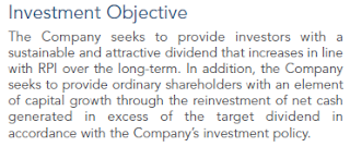
I bought shares in Next Energy Solar Fund (NESF) in November 2019, essentially buying into their investment objective as outlined in their 2019 annual report:

I expected it would reduce the volatility of my portfolio, as it should have steady revenue streams, most of which were backed by Government subsidy. And one reason I like dividends is that they too help reduce portfolio volatility. So it was a typical risk/ reward trade off - lower growth and lower volatility. The KIID implied as much.

At the time 35% - 40% of NESF revenue was not covered by some form of subsidy, and more subsidy free solar development was underway. So this chunk of subsidy free electricity would be subject to the movement of prices on the wider wholesale energy market.

The annual report describes the fund's NAV increasing over 2019 for various reasons, including "...upwards revisions in the forecasts for long-term power prices...". Happy days, unless those power prices go the other way...

Next Energy 2020
I like reading annual reports - it is the chance for the business to put itself in the shop window, and tell the best version of it's story. It is also a more rounded story, with a little more meat than the simple results briefing. It should be convincing, so when it isn't I find it worrisome.

The NESF results weren't great, but not disastrous. NAV down a bit, dividends up a bit. Operationally there were more assets generating more electricity, and a higher capacity. But the Chairman's statement contained the following:


"...power prices and inflation levels have become less correlated..." - which rather matches some of the analysis from the articles linked above. And as a result RPI linked dividends are out of the window, the resulting change to NESF's investment objective has since become "regular dividends":


Subsidy free risk
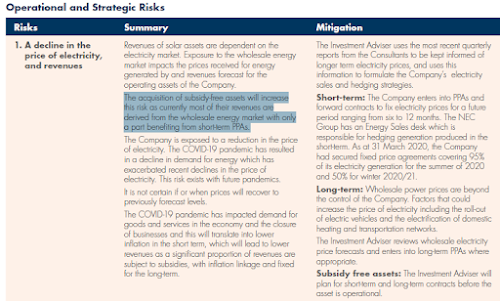
The top "Operational and Strategic Risk" highlighted in the annual report relates to the risk of falling electricity prices: "The acquisition of subsidy-free assets will increase this risk as currently most of their revenues are derived from the wholesale energy market with only a part benefiting from short-term PPAs."

The Chairman acknowledges that 39% of their revenues are without subsidy, and require locking in prices using PPAs:


And that they continue to pursue a subsidy free investment programme, aiming for 150MW by the end of 2020, at a cost of £55m - £80m. Preference shares worth £100m were issued during the year, which I guess is the source of the majority of this cash.

Discount rate
The final bit of irritation was found in their financial KPIs, 

Each year since 2017, the discount rate has been reduced. Since this sits in the denominator of the discounted cash flow they will be using to calculate the NAV, it has the effect of increasing the NAV. Which is mentioned in the discussion of NAV in the annual report:


Unfortunately NESF don't state how they determine the discount rate.

Conclusion
It feels to me as if the business has backed itself into a corner. It's only route to growth being the purchase and development of assets that are generating a product being sold for an ever decreasing profit. Continuing to increase the proportion of subsidy free assets in their portfolio surely can't be sensible, as indicated by their own risk assessment.

Changes to the discount rate have been made without explanation, and since doing this cushions the impact of the falling price of their product, it's not a good look.

I should have identified some of this in my research before purchase. Lesson learnt.


Thursday 27 August 2020

The Volatility Index - VIX

Advice from Warren Buffett includes being greedy when others are fearful. So something known as the stock market’s “Fear Gauge” is probably worth keeping an eye on. This gauge is the Volatility Index, the VIX.

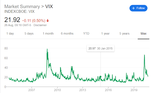
VIX screenshot


The short version of the VIX, is that it is a barometer of expected market volatility based on S&P500 options pricing over the next 30 days. This information is condensed into a single number, which tends to spike upwards when the markets get volatile and unstable.

The VIX was created by the Chicago Board Options Exchange (CBOE) in 1993. It’s initial formulation was based on S&P100 options pricing. In 2003 it was revamped to be based on the S&P500, and tweaked again in 2014 to provide the version of the VIX used today. The CBOE have a white paper describing the VIX calculation and step by step guide here.

As usual there is a bit of unpacking required to really start to get understand what the VIX tells us.

 Options

Options are a way of protecting investments from the movements of the market. Purchasing an option gives the holder the right to buy or sell an investment at a pre-agreed price – no matter what price the market currently has for that investment.

“Calls” and “puts” each can be used to protect from price increases or decreases. A “call” is used to buy at a pre-agreed price, so the holder of a call option is protected against the price of an investment increasing, which would allow them to buy at a price lower than the market. A “put” is used to sell at a pre-agreed price, so the holder of a put option is protected against the price of an investment reducing and allows them to sell at a price that is higher than the market price. Each option has a lifespan, after it’s expiry the option cannot be used.

Of course the protection offered by options comes at a price, and the demand for protection drives that price. If there is widely held view that the price of a certain share is likely to drop significantly then the cost of taking out insurance against that fall though buying put options is likely to increase. 

Those option price movements reflect the anticipated movement of the underlying share prices. Using the analogy of an insurance premium, if two very similar people are paying very different amounts for their car insurance, the difference in price is likely to reflect the risk perceived by the insurance underwriter. In other words, price can be used as a proxy for risk.

The price of options and the movements of those prices are what drives the VIX. The options in question are those which relate to the price movements of the S&P500 expiring in around 30 days (specifically between 23 and 37 days in the future). As people buy and sell options the prices move, the more they move, the more the VIX will increase. The VIX takes an average of these movements and condenses these into a single number.

Volatility

According to the VIX white paper: “the VIX index measures 30 day expected volatility of the S&P500 index”. The volatility is the price movements of S&P500 options, which represents a crowd-sourced indication of the belief that the S&P will increase or decrease in value at various points in time in the next 30 days. Although the VIX is described as the “fear gauge” it is not simply falling prices that drive the VIX, upwards price movements also contribute. It is also not historic, but future, predicted movements that drive it – also known as “implied” volatility. For once statistics has a useful term to describe this – the variance of the prices, both up and down, from an average. The wider this variance gets, the lower the certainty over where markets are headed, and the higher the VIX will be.

Interpretation

The relation between the S&P and the VIX can easily be seen in a few charts here via googlesheets, it shows the S&P500 and VIX values over 3 different time-frames, and a scatter-plot of the same. The trend line of the scatter-plots shows a clear negative correlation between the two. Below is an example of the data from 2005 to 2020:

VIX and S&P500 scatter plot 2005 - 2020
VIX and S&P500 2005 - 2020

As noted above the VIX is a statistical representation of the prices for S&P500 options, more specifically percentage price movements. It is a figure that is annualised - meaning it represents a range of variability for the next year. So if the VIX is at 20, it indicates that the S&P500 is expected to see a range + or - 20% from it's current point over the next year... most of the time. "Most of the time" here is specifically 68% of the time - this is due to some of the stats in the calculation (it represents one standard deviation). If we are to believe the stats, then for the other 32% of the time we should expect the index to be trading outside of this range.

So as we can see, when the VIX spiked up to over 80 in March, this effectively says that we collectively had no idea where the market was headed. The complete lack of certainty had people buying and selling insurance premiums like crazy, forcing the VIX higher. Over the 6 months since then, as people have become more comfortable, the demand for insurance in the form of options has eased off, and so has the VIX.

As a non-trader my interest in the VIX is rather academic, but it is a fascinating construct. I suspect it won't remain dormant for long given the multiple market risks on the horizon...

Saturday 11 July 2020

2020 Mid-year review

Portfolio review Jan - June 2020

Half way through 2020, it's been a hectic year in the markets, so lets see how the portfolio got on. My goals haven't changed:
  • Don't lose money
  • Increase capital by more than the rate of inflation
  • Build a conservative dividend paying portfolio
Through doing the above, I will hopefully also outperform the FTSE All Share Index. I have chosen the FTSE All Share as a benchmark as it most closely matches the pool of companies from which I’m investing. If I start picking stocks from elsewhere, then I might have to change, but it's good enough for now. I'll take a quick look at each of my stated goals to see how things are looking so far this year for the whole portfolio then pull out a couple of points of interest to see which investments were moving the dials.

Don't lose money
The portfolio remains in the green, as do profits, but it hasn't been a comfortable ride in the first half of the year. Excluding new cash invested, you can see below how both the portfolio measured up against my benchmark from January to June.

2020 porfolio performance
The portfolio at the half year mark was roughly 6% below where it was in January, compared to a drop of 17% for the benchmark. It might seem strange to hear that I'm quite pleased by losing 6% over the course of 6 months, but I'm trying to build a resilient portfolio, and by comparison to my benchmark I've not done too badly. My investments fell far less than the wider market, but as that elastic has become stretched, the market is bouncing back quicker than my portfolio. I'm quite content with my investments being less volatile that the market as recovering from large falls in value may take longer than expected.

Increase capital by more than the rate of inflation
On a 6 month timescale this clearly didn't happen, the Office For National Statistics latest inflation stats show it as 0.7%, versus a 6% portfolio fall, so we'll have to see if I can claw that back in the second half of the year. We might well end up with some deflation, if so I could sneak through on a technicality... Essentially this goal is to make sure I'm gaining in real terms, accounting for inflation, so a 6 month timescale is too short a measure to be useful

Build a conservative dividend paying portfolio
Over the past few years big blue chip stocks in the FTSE have provided limited capital growth, instead returning excess cash to investors as dividends. This came to an abrupt halt in 2020 as most companies looked to preserve cash to get them through the various lockdowns happening across the planet. My 15 core portfolio holdings were not immune to this, with 4 of them not paying a dividend in the first half of the year. The language used to describe the lack of dividends varied across the businesses concerned, so we'll have to wait and see if the businesses needed this cash, if they can sensibly invest it or it gets paid out in dividends at a later date. 

My preferred measure of the portfolio dividend yield is a rolling 12 month average yield, this has dropped back a bit since the start of the year, from 2.8% to 2.4%, which reflects both a slight reduction in dividend payments, and increased value of the portfolio. My investments are (mostly) in sensibly run, and conservative businesses that I expect to continue to pay out dividends once the current disruption is behind us. Given the axe taken to dividends over this year, I'll consider my dividend receipts a win so far.

Reflections on volatility
I was a little surprised that I was relatively sanguine during the worst of the market collapse. I admit I thought we were going to see the market drop by around 50%, so it faired better than I expected. When it looked like COVID-19 had moved beyond China, I paused my stock buying - in February it looked like the markets were in trouble. This proved to be a good move. I also didn't buy during the March collapse as I was trying to work out which businesses on my shopping list would be hit hard by the virus and/or lockdown measures, and which might be resilient. Not buying in March proved to be incorrect. Although I didn't suffer an immediate loss in Feb, I would have benefited from buying as the markets bottomed in March.  

Porfolio winners and losers
One of my core holdings, Compass, has been hit hard by the lockdowns. It provides catering services and since most events and companies have been either closed or happening virtually, demand for catering took a big hit. Trading updates indicated that around 50% of the business was closed. I'm comfortable staying invested, with the assumption that their scale will be a benefit over the long term. 

The contribution that each of the portfolio has made to the first half results is below:
Portfolio contributions to result

Compass is the clear outlier dragging down performance significantly. This is partly due to the fall in share price, but also to it being my 4th largest holding at the start of the year. 

Individual performance of investments is below:
H1 2020 portfolio performance

The two members of the portfolio I was thinking of selling 6 months ago, I dithered over. As a result Saga and Dignity are still there, albeit very small holdings. I'm in two minds whether to get rid of them, as they are irritants, and I don't regard either as sensible investments. Saga may see a decent bounce if we get good news on the medical front that enables it's cruise ships to set off. One the other hand, they are both very small amounts of cash, so unlikely to have much impact on the overall portfolio whichever way they move.

There are plenty of reasons to be concerned over the state of the markets, with an imminent global recession, US attempts to address the virus seemingly unravelling, a US election, Trumpy's fondness for tariffs, and Brexit. However I suspect all will be ignored if we get good news on vaccines and medical treatments for the virus. Whether that good news is already priced in we will find out in due course...

Sunday 21 June 2020

Insolvency

If the 2008/9 financial crisis was characterised as a credit-crunch, the 2020 COVID-19 crisis will probably be looked back on as a liquidity-crunch. Businesses were forced to shut down to help enforce social distancing, and as a result, in many cases, forgo any income for a period of time. It happened so quickly there was little time to organise a smooth landing for all parts of the economy, so many bills still had to be paid despite the lack of income. Investors would have seen unscheduled updates from the businesses they hold, stating their liquidity position, giving detailed breakdowns of borrowings, cash in the bank - all to reassure investors that they would survive the shut-down if it only lasted for x number of weeks/months.

I'm certainly better acquainted now with the notes in the accounts giving details on borrowings, restrictions and covenants attached to them, and when those debts need to be repaid. Many investors are cautious with regard to debt, the virus brought home exactly why. The spectre of insolvency became suddenly very real.

Insolvency is one of those words that I thought I understood - but only because I've never had to use it or think about it. There are a few bits of vocab that I have always confused, and as it turned out, researching and unpicking these provided much of the clarification I was after. I enjoy a good rummage on the internet for sources of information - in this case it was the legislation documents themselves. So apologies in advance to anyone legally literate for the rest of this post 😎.

Spoiler alert - it doesn't end well for shareholders.

Bankruptcy ≠ Insolvency
If a person owes money that they cannot repay, then they can be declared bankrupt. The individual or their creditors can apply to a court to become bankrupt and a legal process is then put in place to manage payment of debts, which can include formally agreeing to not repay the debt. The Government's Insolvency Service guide to bankruptcy is available here.

A company typically might have 3 different types of debt, 
  • bonds or credit notes which are sold on the debt markets
  • a loan/ credit facility which is provided by a lender
  • goods/ services on credit from a supplier
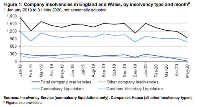
If a business cannot repay these debts (in the UK at least) they do not go bankrupt, but will become insolvent. Insolvency is a legal process, and as such there is legislation to follow - the Insolvency Act 1986. 
insolvency service month insolvencies

(Interestingly above the numbers of insolvencies reduce after COVID-19 appears - possibly due to Government support measures, and also to the courts shutting down.)

Insolvency has a specific definition:
A company may be wound up by the court if—

(f)the company is unable to pay its debts


Even more specifically (and worryingly) the act (section 123(1)(a)) states that if a debt of at least £750 is unpaid 3 weeks after a written demand for it has been received, then the business may be regarded as insolvent. I'm sure many companies have payment terms that exceed this duration, but I'm not sure insolvency proceedings are the best way to get a hurry up on one's invoices, although it's likely to get people's attention...

There is also this juicy snippet in the Act:

A company is also deemed unable to pay its debts if it is proved to the satisfaction of the court that the value of the company’s assets is less than the amount of its liabilities, taking into account its contingent and prospective liabilities.


No wonder then that companies have been rushing to prove adequate liquidity and demonstrate the strength of their balance sheets over the last few months.

Ok so we've established what insolvent means, what next?
If a company cannot pay it's debts it has a number of options open to it:
  • Company voluntary arrangement (CVA), whereby the directors attempt to come to an agreement with creditors to accept less of the debt being repaid, but the company continues trading. 
  • Administration. This involves appointing an administrator to take control of the company with a view of hopefully rescuing the company, often through a sale of the business. Or if not then through the sale of assets and passing the resulting cash to creditors.
  • Liquidation - sell the company's assets to pay off creditors, and close down the business.
Company Voluntary Arrangement (CVA)
The main problem with insolvency is the repayment of debt, so the CVA is a process for companies to ask creditors to reduce this debt, with the trade off being the increased probability that the business survives. For example a proposal may be to ask creditors to accept 80% of the outstanding borrowings, which will be repaid over 4 years, and in return the business will restructure in a certain way. Once the proposal is ready, creditors vote on the proposal and require creditors accounting for 75% of the value of the debt to agree. This has been a favourite tool of struggling UK retailers over the past few years, in particular with regard to property rents.

Administration
If a business goes into Administration an insolvency practitioner is appointed as administrator to take over management of the business from the directors. Their goal is not initially to shut down the business, but to rescue it. This is set out in the Insolvency Act:

Purpose of administration

3(1)The administrator of a company must perform his functions with the objective of—

(a)rescuing the company as a going concern, or

(b)achieving a better result for the company’s creditors as a whole than would be likely if the company were wound up (without first being in administration), or

(c)realising property in order to make a distribution to one or more secured or preferential creditors.


Once an administrator has been appointed, creditors are barred from pursuing attempts to reclaim their loans unless given explicit permission by the courts. This provides the business with the time to work out a solution to it's indebtedness. This proposed solution is then presented to the creditors, who vote on the proposal, and if they can't form a majority the courts decide on an outcome.

Should the administrators find themselves unable to rescue the business, they may decide that they need to enter liquidation. This means that they will sell the companies' assets in order to raise the funds needed to pay creditors.

Liquidation
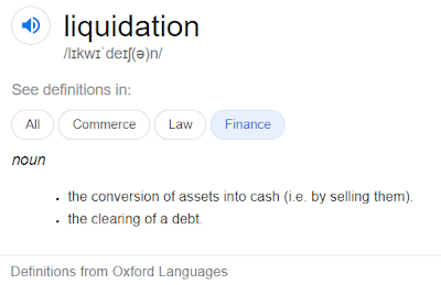
Liquidation simply means turning assets into cash, i.e. selling them. This is done to pay creditors, and if there is anything left over - to return this to shareholders. The process of liquidation can be started by the business, or can be forced upon it by the courts. Or of course the company administrator can move the business into liquidation if a rescue isn't possible.

definition of liquidation


What does this all mean for shareholders?
The good news is that shareholders have limited liability for the companies in which they invest - which means they are not liable for any debts incurred by a business. The bad news is that their investment may be lost.

It may not come to a complete wipeout, but shareholders are not first in the queue when it comes to payments from an insolvent business. First come those who have secured lending, then the fees of the administrators, then employee wages and pension contributions, then creditors with unsecured lending, floating charge holders, interest on debts, company share schemes, preferential shares....and then ordinary shareholders...no wonder there is little left to distribute to the average investor...

On that cheerful note, happy investing.

Thursday 21 May 2020

Investing - measuring risk

Investing is often talked about in terms of risk and reward, and as an attempt to balance these two elements. Currently everything feels risky, governments have been putting their economies into hibernation, central banks have turned the money printers up to 11, all to help combat a virus to which we have no medical solutions.

So given the rather frisky nature of the markets of late I decided to look into how investors try to measure risk.

As we’ll see below to a large extent risk is often framed in terms of volatility. To some extent I think this is reasonable. If an investment moved 50% up and down randomly from an average price each day, it would be quite difficult to know when might be a good time to buy or sell. Another investment that only moved 5% would provide some consistency in pricing that might make owning it more palatable.

Perhaps more problematic with using volatility as a measure of risk is that in one direction volatility is surely desirable – a valuation moving rapidly upwards is generally regarded as a good thing. The same degree of volatility going the other way isn’t usually welcome.

I'll look at 3 risk measures:
Beta
Sharpe ratio
Sortino ratio

I’ve set up a googlesheet here to download and play with if you’re so inclined. It shows the measures above, with all the components broken out. It also has a simple scatterplot with regression line, correlation and r², in case these also float your boat.

Beta
Beta is a notion that essentially compares the volatility of an investment against a benchmark (the “market”). The benchmark is given a beta of 1, a beta above 1 indicates that the investment is more volatile than the benchmark, and a beta less than 1 that it is less volatile than the benchmark.

You’ll find it on sites like Yahoo finance – looking at a couple of examples on there, as of mid-May 2020 Diageo has a beta of 0.33 and Lloyds has a beta of 1.1. Booze is less volatile than banking apparently. However, Yahoo don’t state how they have calculated the figure, so a little pinch of salt is required, but it is probably correct to think that a company selling booze will have more stable and consistent returns than a bank which will be tightly aligned to macro-economic conditions.

Beta doesn’t state an absolute degree of volatility but relative to a benchmark. It is a function that for any given input tells us what to expect as an output. In the cases above, if the numbers are to be believed, for every 1% of change in the market, Diageo typically has a change of 0.33%, and Lloyds has a 1.1% change.

Lets take a simple example to understand the principle better, there are plenty of rabbit holes online to disappear into if complexity is what you’re after.

Beta tells us roughly what % change to expect in an asset’s price given a 1% change in the market. Let’s set up a simple pretend business “WidgetX” and see how it performs in good and bad conditions, and how the market also performs:


Good times
Bad times
WidgetX
30%
-20%
Market
20%
-10%

What we can see here is that the price of an investment in WidgetX tends to be up by around 30% when market conditions are good, but down by 20% when conditions are bad. Whereas the market tends to be up by 20% and down by 10% during these conditions.

If we take the range of scores from WidgetX and the market we get:
WidgetX range = 50
Market range = 30
50/30 = 1.67

So if the market changes by 1%, WidgetX tends to change by 1.67%, which tells us the company is rather sensitive to changes in the underlying market. A bit like Lloyds above which typically moves more than the market, Diageo, on the other hand is insensitive to market conditions, they keep selling booze no matter what’s going on.

To come back to the point above about volatility and direction, this sensitivity will result in a greater movement up and down, so we might expect Lloyds to outperform the market in good years, and to underperform in bad. Diageo, would likely underperform the market in good years and outperform in bad.

Beta is calculated as follows:

Beta = covariance of investment & market / variance of the market

The covariance of both investment & market measures how these two move relative to each other. A positive number indicates that they tend to move in the same direction together. A negative number indicates that they tend to move in opposite directions.

The market variance is simply the amount of variability in the returns from the market from an average - the mean return.

This is all very well, but as discussed more below, not all volatility is created equal.

Sharpe ratio
The Sharpe ratio is next on the list and is described as a way to understand an investment’s “risk-adjusted returns”. In other words the amount of return per unit of risk. As with beta above, the notion of risk is based on volatility – in this case the standard deviation of the investment’s returns. (To save a google for those rusty with stats, standard deviation is a measure of the variability of data, which is established by measuring the distance of each data point from the mean of all of the data)

The “return” in the Sharpe ratio is the return of the investment after taking away the return that a “risk-free” alternative would have generated. What is left after the “risk-free rate” is subtracted is called the “excess return”. The "risk-free rate" is often represented by US Treasuries (debt backed by the US Govt). Given that at the time of writing, mid-May 2020, the 2, 5 and 10yr US Treasuries yield less than 1%, they may not be the best “risk free rate”, the 30 yr only has a yield of 1.42%...

After finding our excess return we then divide this by our volatility – the standard deviation of the investment’s returns. This gives us a measure of return for each unit of volatility.

A quick example, imagine our WidgetX business above generates a return of 25% and we have a risk free rate of 5% then the excess return is 25% - 5% = 20%. If the standard deviation of the WidgetX returns was 15, we would then divide the excess return by this, 20/15 = 1.33. So our Sharpe ratio would be 1.33.

What does a Sharpe ratio of 1.33 mean? On it’s own, not a lot, but using it to compare different investments might help – let’s see how the iThing company measures up to WidgetX


Return
Risk free rate
Standard deviation
Sharpe ratio
WidgetX
25%
5%
15
1.33
iThing
25%
5%
10
2

Both companies generate the same return, but have quite different Sharpe ratios, telling us that for each unit of risk, WidgetX gives us 1.33 return, whereas iThing gives us a return of 2. Since the return on both investments is the same (25%) it is the denominator in our equation that changes, that the risk, or volatility of iThing is less than WidgetX.

The Sharpe ratio is calculated as:

Sharpe ratio = (Investment return – risk free rate) / standard deviation of investment returns

By using the Sharpe ratio we could try to build a portfolio that generated the highest return for the least amount of volatility.

It does, however, have the same fundamental issue as beta, it assumes that all volatility is the same. A 10% change in the price of an investment has the same amount of volatility whether it is up or down – it’s impact on the likelihood of me achieving my financial goals is not the same however. I want to be exposed to the risk of my investments going up. Risk should have a component that accounts for the detrimental impact of something that makes goals more difficult to achieve. Our final ratio does just that.

Sortino ratio
The Sortino ratio is a modification of the Sharpe ratio. It is calculated in a similar way but rather than using the deviation all all price movements to represent risk, it focuses on the element of volatility most of us find uncomfortable – prices falling.                                          

Before digging into the Sortino ratio lets first revisit the statistical notion of standard deviation as it is this that is modified in the shift from Sharpe to Sortino.

From Wikipedia:
“In statistics, the standard deviation is a measure of the amount of variation or dispersion of a set of values.A low standard deviation indicates that the values tend to be close to the mean (also called the expected value) of the set, while a high standard deviation indicates that the values are spread out over a wider range.”

It is calculated by first establishing the mean of the set of values, and then measuring the distance of each value from the mean. A little more numerical jiggery-pokery gets you to the standard deviation. In most uses this is perfectly reasonable, but as mentioned a few times above, as investors, the direction of the deviation matters. This deviation is regarded as volatility in investing, which is equated, rightly or wrongly with risk. What we really need to do is extract the risky part of the volatility – i.e. an investment losing value.

Downside deviation is what we are looking for. This focusses specifically on downward price movements and uses the volatility of those negative movements – the standard deviation of the losses.

The Sortino ratio calculation is below:
Sortino ratio = (Investment return – risk free rate) / standard deviation of negative investment returns

I’ve highlighted the word “negative” above, as it is the key difference between the Sortino and the Sharpe ratio.

Let’s take our two companies again and apply the Sortino ratio:

Return
Risk free rate
Standard deviation of negative returns
Sortino ratio
WidgetX
25%
5%
5
4
iThing
25%
5%
10
2

In this case both companies have a return of 25%, from which we subtract the risk free rate of 5%, to leave both with a return of 20%. WidgetX has a lower volatility of downside movements, it’s standard deviation of those movements are 5, whereas iThing has a much more volatile price, with a standard deviation of 10. If we plug these numbers into the denominator of our sortino ratio, we get a score of 4 for WidgetX and 2 for iThing. This indicates that we although we got the same return for both, we had to suffer twice the amount of downside volatility for iThing than WidgetX. As a risk adjusted return, to me this captures much more of the notion of risk, i.e. risk of losing money, than the Sharpe ratio (which includes the risk of making money).

The Sharpe ratio penalises an investment for price appreciation which is included in it’s definition of risk. Whereas the Sortino ratio isolates risk from return by focusing only on downwards price movements – the negative volatility that investors would prefer to avoid. 

So as a risk averse investor I should seek out potential investments with a higher Sortino ratio because it means that the investment has earned more return per unit of risk that it takes on.

The Sortino ratio seems closely aligned to the sensible idea of not losing money, which I discuss here.
To save you scrolling back up, the link to the googlesheet with all the above calculations is here.

Saturday 18 April 2020

Watchlist review


It’s been a wild few weeks in the markets. My response has been less wild, and has mainly been an attempt to review the companies on my shopping list to try to ascertain what the impact of COVID-19 might be on these companies. It’s not just a matter of what might happen over the next few weeks, but whenever we get past this virus, what sort of shape these businesses are going to be in.

Assuming we have another year or so before a vaccine is available to make COVID-19 go away, the intervening period could involve various business disruption, social distancing, further lockdown measures, and public testing protocols. So when I’m considering making a purchase, I now need to think about how the business in which I’m investing is going to make it through this? Part of my review over the past few weeks was to look through my preferred list and ask myself some questions:
  • how has the company management responded to the crisis?
  • are they still making money today?
  • will they still be taking in cash throughout this crisis, even if cash flows are disrupted?
  • how will multiple waves of infection affect them?
  • how will public testing protocols affect them?
As an example, Greggs, the low key tasty pastry seller, has quietly been making investors very happy over the past few years. It’s been churning out great results, keeping a really simple business, just rolling out more of it. They are currently closed and making zero revenue. They went into the crisis with no debt, as of 9th April had £47m in cash and were taking up the Government offers of support, so will very likely still be operational once we all emerge from our homes. They are likely to serve up tasty grub to millions of punters once again, and the management team have acted and communicated clearly. But what will be the cost of being closed for the length of time that they are required to do so? What is the impact on their finances, staff, suppliers & partners. How would they manage getting customers into their stores after lockdown - if we all have to wear masks, do they think customers would just pop up the mask to take a bite of their sausage roll? Will they test each customer before letting them into the shop? The impact and cost is unknown, so for me it makes investing in such a company very difficult.

Rightmove is (was?) another business on my shortlist. An incredible investment with operating numbers off the charts and a genuine moat. On 18th March they stated they would defer part of their subscription for up to 6 months for some estate agents, had a strong balance sheet, but were not buying back shares (revealing the flawed logic in shared buybacks – if now wasn’t a good time when would be?). 2 days later another announcement stated that they would reduce their subscription fees by 75% for 4 months, which superseded the deferment offer. 7 days later another statement cancels the dividend. A company that has looked so astute, suddenly looks indecisive, dithering and panicked. The extent to which they make it through this in a position of strength is largely dependent on the survival of the estate agents and their subscriptions – so why ask them to pay anything if the Rightmove balance sheet is so strong. A strange series of statements that do little to endorse the management of the business, just when you need clear heads.

Admiral insurance as a 3rd example – the share price has hardly moved over the past few weeks. Amazingly resilient share price – doesn't seem to give a monkey's about COVID-19.

There are no answers to any of this, markets may get cut in half, or may surge to new highs. It’s difficult to work out if share price falls constitute bargains or not. After all if businesses are making less money, and the share price has dropped by an equivalent amount, the value of the business has arguably stayed the same.

Using Price to Earnings (P/E) values as a short hand for valuation:
Price = 150
Earnings = 10
P/E = 15

With a 20% reduction to price
Price = 120

With a 20% reduction to earnings
Earnings = 8

PE = 15

In other words the valuation is unchanged.

To flip the P/E into the earnings yield (E/P - earnings divided by price) we can show the same as the above:
Price = 150
Earnings = 10
Yield (E/P) = 6.7%

With a 20% reduction:
Price = 120
Earnings = 8
Yield (E/P) = 6.7%

Valuations are unchanged.

The problem is most companies don't know what impact the measures to inhibit the spread of the virus will have on them.

What adds to the madness is not knowing what is supposed to be baked into the share price. If it is supposed to be all future discounted cash flows, losing a quarter or two of earnings shouldn’t make much difference, so why the large moves in share prices?

Taking a simple approach to the Rightmove example above, the reduction in fees will apparently lead to a £65m - £75m cut in revenue for 2019. They made £289m in revenue in the prior year, taking the midpoint of the revenue impact as £70m, leaves us with around a 24% drop in revenue. The share price dropped over 40% from mid February to the low on the 23rd March, the cancelled 4.4p dividend would only have accounted for a small % of the loss (the share price dropped to around 400p – equating to cancelling a 1% payout). It looks as if the market is pricing in bad news for Rightmove, is it a margin of safety? As noted above the condition in which the business comes through this is predominantly about their customers, it’s not something that Rightmove control. This makes it very hard to invest into.

Banging a few numbers into spreadsheets to get some back of the envelope calculations has helped, but it has also been useful to revisit these companies and try to think through not only will they survive, but in what shape. It’s certainly led to some movement on the shopping list, with a few companies being removed completely. Strange times.