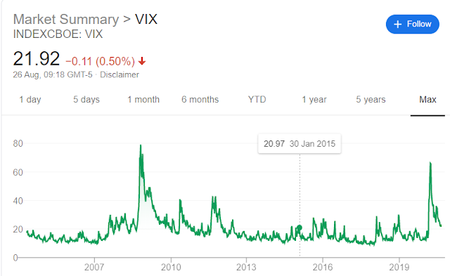
Advice from Warren Buffett includes being greedy when others are fearful. So something known as the stock market’s “Fear Gauge” is probably worth keeping an eye on. This gauge is the Volatility Index, the VIX.
The short version of the VIX, is that it is a barometer of expected market volatility based on S&P500 options pricing over the next 30 days. This information is condensed into a single number, which tends to spike upwards when the markets get volatile and unstable.
The VIX was created by the Chicago Board Options Exchange (CBOE) in 1993. It’s initial formulation was based on S&P100 options pricing. In 2003 it was revamped to be based on the S&P500, and tweaked again in 2014 to provide the version of the VIX used today. The CBOE have a white paper describing the VIX calculation and step by step guide here.
As usual there is a bit of unpacking required to really start to get understand what the VIX tells us.
Options are a way of protecting investments from the movements of the market. Purchasing an option gives the holder the right to buy or sell an investment at a pre-agreed price – no matter what price the market currently has for that investment.
“Calls” and “puts” each can be used to protect from price increases or decreases. A “call” is used to buy at a pre-agreed price, so the holder of a call option is protected against the price of an investment increasing, which would allow them to buy at a price lower than the market. A “put” is used to sell at a pre-agreed price, so the holder of a put option is protected against the price of an investment reducing and allows them to sell at a price that is higher than the market price. Each option has a lifespan, after it’s expiry the option cannot be used.
Of course the protection offered by options comes at a price, and the demand for protection drives that price. If there is widely held view that the price of a certain share is likely to drop significantly then the cost of taking out insurance against that fall though buying put options is likely to increase.
Those option price movements reflect the anticipated movement of the underlying share prices. Using the analogy of an insurance premium, if two very similar people are paying very different amounts for their car insurance, the difference in price is likely to reflect the risk perceived by the insurance underwriter. In other words, price can be used as a proxy for risk.
The price of options and the movements of those prices are what drives the VIX. The options in question are those which relate to the price movements of the S&P500 expiring in around 30 days (specifically between 23 and 37 days in the future). As people buy and sell options the prices move, the more they move, the more the VIX will increase. The VIX takes an average of these movements and condenses these into a single number.
Volatility
According to the VIX white paper: “the VIX index measures 30 day expected volatility of the S&P500 index”. The volatility is the price movements of S&P500 options, which represents a crowd-sourced indication of the belief that the S&P will increase or decrease in value at various points in time in the next 30 days. Although the VIX is described as the “fear gauge” it is not simply falling prices that drive the VIX, upwards price movements also contribute. It is also not historic, but future, predicted movements that drive it – also known as “implied” volatility. For once statistics has a useful term to describe this – the variance of the prices, both up and down, from an average. The wider this variance gets, the lower the certainty over where markets are headed, and the higher the VIX will be.
Interpretation
The relation between the S&P and the VIX can easily be seen in a few charts here via googlesheets, it shows the S&P500 and VIX values over 3 different time-frames, and a scatter-plot of the same. The trend line of the scatter-plots shows a clear negative correlation between the two. Below is an example of the data from 2005 to 2020:
 |
| VIX and S&P500 2005 - 2020 |
As noted above the VIX is a statistical representation of the prices for S&P500 options, more specifically percentage price movements. It is a figure that is annualised - meaning it represents a range of variability for the next year. So if the VIX is at 20, it indicates that the S&P500 is expected to see a range + or - 20% from it's current point over the next year... most of the time. "Most of the time" here is specifically 68% of the time - this is due to some of the stats in the calculation (it represents one standard deviation). If we are to believe the stats, then for the other 32% of the time we should expect the index to be trading outside of this range.
So as we can see, when the VIX spiked up to over 80 in March, this effectively says that we collectively had no idea where the market was headed. The complete lack of certainty had people buying and selling insurance premiums like crazy, forcing the VIX higher. Over the 6 months since then, as people have become more comfortable, the demand for insurance in the form of options has eased off, and so has the VIX.
As a non-trader my interest in the VIX is rather academic, but it is a fascinating construct. I suspect it won't remain dormant for long given the multiple market risks on the horizon...

No comments:
Post a Comment