Thursday 14 March 2019

Compounding


There are plenty of articles and tools on the web to show the importance of compounding when it comes to owning shares, but I like to try to work through these things in my own way to try to get a better understanding of them.

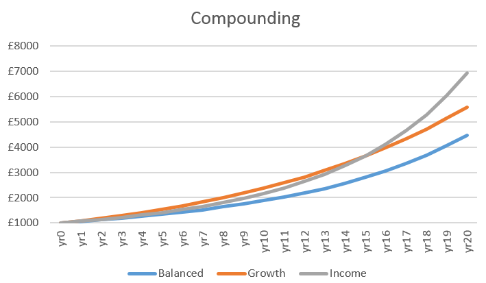
In order to do that I took three theoretical shares with different “profiles” and indulged in a little time travel. Each of the shares have an average “growth return” across share price growth, dividend yield and dividend growth of 3.5%.

The first is a “balanced” stock, representing a business growing slowly, generating a steady supply of spare cash to help grow the business and also able to offer a reasonable dividend that it can grow consistently. I think a suitable example would be Unilever or Diageo.

Stock 1: Balanced
Share price growth
3%
Dividend
3%
Dividend growth
5%
Average growth
3.5%

The second is a “growth” stock, representing a business wanting to reinvest most of it’s spare cash back into the business, but still maintaining a small dividend and little dividend growth. Examples of this type would be Ocado, or NMC Health.

Stock 2: Growth
Share price growth
8%
Dividend
1%
Dividend growth
2%
Average
3.5%

The third is an “income” stock, representing a business that is struggling to grow, but generating lots of cash that it returns to shareholders as dividends. Maybe the zero % growth looks odd, but lets assume the price oscillates  around a central point. I think businesses such as Shell or HSBC would fall into this category.

Stock 3: Income
Share price growth
0%
Dividend
7%
Dividend growth
4%
Average
3.5%

My investment into each of the above businesses is £1000, which is untouched for 20 years. Over that time, all dividend payments are reinvested by buying more shares of the same business. To make life easier, I’m assuming no taxes, and no transaction fees.

Clearly no stock would rise by the same amount each year, there would be ups and downs, maybe dividend cuts, or additional payments. As the fictional “growth” business grows it’s rate of growth would slow…there are all sorts of caveats that could be built in, but I’m not going to because it’s a nice tidy thought experiment…

The results are interesting:
Balanced
Growth
Income
Total change
348%
459%
593%
Annualised total return
7.8%
9.0%
10.2%


share price compounding experiment

So what’s my conclusion – look for a big dividend?

As most commentators tell us, the dividend has to be sustainable. This is even more evident once the time span is stretched out to 20 years, and yet more if the share price isn’t going anywhere. So how do we get sustainable dividends – by buying into well managed businesses. But also businesses that should be able to continue chugging away indefinitely.

My conclusion, quality businesses are the target, not any particular business “profile”. If I invest in quality, I can sleep at night, in fact I’d like to think that I can just buy the shares and forget about them.

I’m not convinced everything in my portfolio is a quality investment, but thankfully I’m comfortable that my main investments are. Whenever I check my portfolio, I’m always drawn to those shares I’m not confident in. I often forget to check those quality businesses, but whenever I do, I usually find they are slowly but surely increasing in value.

Friday 8 March 2019

February Portfolio and Purchases

I was sitting on my hands until later in the month to see if the Brexit voting moved any of the prices of the shares I'm interested in - it did, a little. Mainly I think due to a slight pickup in sterling here and there which brought down the price of a few multinationals on the FTSE100. There were also a load of businesses reporting over the last couple of weeks of February - again I was mostly in spectator mode as not a lot on the shopping list looked particularly cheap.

Portfolio
On the portfolio front, up over 3.6% in February compared to my chosen benchmark which increased 2.3% - the benchmark being the Vanguard FTSE All Share Accumulation that I'm taking as a proxy for the FTSE All Share. If I'm buying AIM shares, I should probably take a different benchmark, but this will do for now.

Gold star for best performer of the month goes to Lancashire Holdings (LRE), +17%. Jersey Electric (JEL) went the other way -3%, so is on the naughty step.

Just a small speculative buy this month, with an eye to the future:

February share purchase: FCRM
Back to the AIM this month, for Fulcrum Utility Services (FCRM).  Fulcrum provide a range of services relating to gas and electricity connectivity, smart meters, but of more interest, electric vehicle charging points.They were listed on the AIM in 2009 and have a market cap of £100m.

The December interim results showed a continuing growth story, with an increased order book, increased revenues and a net cash position. They tick a number of boxes indicating continued growth, and nice to see an unused credit facility too. All of their business segments were showing increased revenue according to their interims.

I like the idea of investing in companies working to deliver cleaner energy solutions, including electric vehicles, hopefully we'll see the trend of increasing electric vehicle adoption continue. So Fulcrum get a thumbs up, as does their 4% dividend, also nice to see the board aiming for solid 2x dividend cover too. I'm expecting the markets to get a bit wobbly given the Brexit shenanigans in March, hopefully we'll see a few bargains pop up.

Monday 4 March 2019

Reinventing the wheel

Whilst browsing the internet on a rainy afternoon I read an interesting article from Moneyobserver, indicating which funds they have consistently viewed as highly rated over the last 6 years - the date at which they started a shortlist of rated funds. It got me wondering whether these highly rated funds and their managers were all invested in the same small pool of businesses, or whether they were all heading off in different directions.

If I assume that all fund managers have at least a rather generic goal of trying to increase the value of their holdings, if there are great similarities in their portfolios, maybe I could take a leaf from their books.

But which funds?...a rummage on moneyobserver gave me a few options so I selected a basket from the following pages:
https://www.moneyobserver.com/which-rated-funds-have-kept-their-rated-stamp-our-shortlist-was-launched
The UK and global (not-emerging markets) categories here:
https://www.moneyobserver.com/money-observer-2018-fund-awards-performance-and-reliability-winning-mix
And the top 10 best performing funds over 5yrs from here:
https://www.moneyobserver.com/money-observer-rated-funds?sort=desc&order=Perf.%205Y

That gave me an initial group of 46 funds, with 3 duplicates, leaving 43 to play with.

And to make this a little more manageable:
  • include only the top 10 holdings in each fund
  • include only only those businesses listed on the FTSE
  • ignore % of the fund portfolio allocated to that equity
Rather than try to navigate the webpages of each fund I used Hargreaves Lansdown to grab the top 10 holdings of each fund to make life easier.

Once I removed funds without any FTSE listed holdings in their top 10 I had the following 24 funds:
AXA Framlington monthly income
Bailie Gifford global income growth
Bankers it
Barclays UK lower cap
CFP SDL Buffetology
Franklin UK rising dividends
Impax environmental markets it
JPMorgan uk strategic equity fund
Jupiter European opps it
Jupiter UK smaller companies
Lindsell Train Global Equity
Man GLG uk income
Marlborough UK micro cap grth
Marlborough UK multicap growth
MI Metropolis values
Newton global income
Royal London sust world trust
Slater recovery
Sli global companies
Threadneedle mthly extra income
Threadneedle UK equity income
TM Cavendish aim
Troy income & growth
Witan it
A few familiar names, and a sprinkling of the esoteric. The Threadneedle funds had the same Top 10, albeit with different weightings, so I dispensed with one of them. It did strike me that it was a bit cheeky to run two funds with the same holdings...

Next, I took the complete list of different shares, 93 different businesses in total, removed duplicates and counted the number of times each appears in a fund. Those that appear in more than one fund are below:
Business
No. Funds
Royal Dutch Shell
7
GlaxoSmithKline
6
Diageo
5
Unilever
5
Lloyds Banking Group
4
RELX
4
Experian
4
AstraZeneca
4
BP
4
Imperial Brands
3
Craneware
3
HSBC
3
Prudential
3
British American Tobacco
3
Rentokil Initial
2
Phoenix Group Holdings
2
Reckitt Benckiser Group
2
London Stock Exchange Group
2
RWS Holdings
2
Rio Tinto
2
Bellway
2
Homeserve
2
Dart Group
2
JD Sports Fashion
2
Smith (DS)
2
AB Dynamics
2
Serica Energy
2
If I was using this as a basis for my portfolio, I would remove the banks and mining companies, simply because I don't understand them. I don't claim to know how each of these work, but I don't rate my changes of accurately estimating the leverage risks associated with HSBC, or the direction of the global commodity markets that drive Rio Tinto's revenues. Perhaps obviously there are most of the largest names in the FTSE 100 topping the list, makes me wonder why you'd pay a management fee to someone to buy these for you when it's easy enough to do it yourself.

Still, there are a couple of interesting businesses in there. Food for thought.

Monday 25 February 2019

Stock analysis: Telecoms


There has been a lot of noise about impending economic uncertainty, and likely stock market volatility so where might some of this roller coaster be avoided? Nice safe defensive stocks maybe? They don’t come much more defensive than utility/energy companies – providers of water, electricity etc. However, these come with increasing regulatory oversight, potentially squeezing profits, and the current Labour party have indicated a desire to nationalise such businesses. Another sector that has very similar defensive characteristics without the same restrictions and risks is telecoms – providers of mobile and internet infrastructure. Today these provide a service considered indispensable by most, so should have a very dependable income, and hopefully a nice safe investment. Lets find out.

There are 2 telecoms businesses listed on the FTSE 100:
·        BT Group (BT.A)
·        Vodafone (VOD)

And 2 listed on the FTSE 250:
·        Talktalk Telecom Group (TALK)
·        Telecom Plus (TEP)

Telecom Plus also provide a range of energy services so at least part of their business may end up subject to similar regulatory and political risks as other utilities/energy providers, and since nearly 80% of their 2018 revenue was generated by their Electricity and Gas segments I’m excluding them. They do, however, have a very interesting low capital business model, so I’ll be taking a closer look at them at some point. (If you're wondering why the link for TEP takes you to utilitywarehouse.co.uk, scroll to the bottom of the webpage and you'll see that it is a subsidiary of TEP.)

There are other telecoms businesses out there of course, I bought a few shares of MANX last month, but to keep this manageable I will start with these bigger businesses.

So, Vodafone, BT, and Talktalk... lets crunch a few numbers and see if any of them merit a closer look.

How big?
Since these 3 live in different indices, or in different parts of the same, let's first check out their respective sizes:

In terms of size (24th Feb 2019): 

Market Capitalisation
revenue
employees
% rev per employee
BT Group
£22629m
£23723m
105800
0.0009%
Talktalk
£1123m
£1708m
2226
0.0449%
Vodafone
£37889m
£41214m (€46571m)
104000
0.001%

For all financials I’ve taken the last 10yrs published accounts, from 2009 to 2018. It would be no fun if all 3 companies reported in sterling, so Vodafone report in Euros, so I’ve translated everything back into sterling using historical average exchange rates taken from here

Vodafone is clearly the largest company here, in terms of market cap or revenue. Both Vodafone and BT Group dwarf Talktalk in most cash and valuation measures, not to mention geographic coverage, however, Talktalk generates significantly more revenue per employee. Does this mean we have a hare and a couple of tortoises here? What would an historic investment in any of these companies have returned?

Don't look back in anger...
£1000 invested in these businesses 10yrs ago would have generated the following return (including dividends):

BT, Talktalk, Vodafone Historical Investment

Well that's not overly inspiring. An investment in Talktalk would have peaked in 2015, and BT around 2016, dropping ever since. Vodafone was plugging away until last year, when it too decided to roll over. The best of the bunch is BT, which would have made a healthy 275% if you'd sold at the top (including dividend payouts). 


Capital
Total dividends
Total return
BT Group
1713
768
2481
Talktalk
920
851
1771
Vodafone
1097
760
1857


Even less inspiring when you look at the figures rather than the chart. Ignoring dividends, Vodafone would have made me £97 and Talktalk would have lost me £80. From a 10yr investment.

Careless talk
Talktalk have been in bother in for failing to look after data properly in the past, and it doesn't take long to find some disconcerting numbers with their performance over the years too:
Talktalk revenue, profit, fcf
Revenues and profits dipping, and not much cash flow. These are expensive businesses to run, with plenty of money needed for maintaining existing infrastructure, plus moving with the times and investing in new technology - rolling out 5G for example. I was expecting to find pedestrian growth, but I'm struggling to see any growth. Since the share price is flat, dividends must be a key component of the investment case here, but without enough free cash flow, they won't be secure either.

Good times ahead?
Maybe these have been some lean years for Talktalk (admittedly that's a lot of lean years). let's give them the benefit of the doubt, maybe it's all about to turn itself around. So let's take a quick look at Return on Capital Employed (ROCE), one of the preferred measures of how effective the business is at making money:
BT, Talktalk, Vodafone ROCE
Whilst Vodafone might be starting to turn around, BT and Talktalk have been steadily getting less effective. At this point I need a reason to keep looking at Talktalk - as I mentioned above dividends seem to be the only reason to invest, how secure are they?
BT, Talktalk, Vodafone FCF/Dividend cover
Cover for the the dividend at Talktalk has been slim to none for a while. So, this is a business struggling to increase revenues and profits, an investment that after 10ys would have seen my capital decrease, and it has an insecure dividend. Sorry TALK, I wish you well, but you're off the list.

BT isn't doing much better either - at least from what we can see in the above ROCE and dividend cover. Steadily worsening ROCE, dividend cover heading the wrong way...But an investment here 10 years ago, if dividends are included, would have increased by nearly 150%, I wonder what are the chances of this repeating over the next 10 years.

Borrowed time?
BT are not comparing favourably on efficiency (ROCE) or dividend security (FCF dividend cover). Do they at least have a well managed balance sheet?
BT, Vodafone debt vs. income
Above is a ratio of the total debt (long term + short term borrowings) on the balance sheet, which I've divided by operating income. BT has been holding this ratio steady, Vodafone - not so much. A tick in the box for BT? Not if you include pension deficits as debt - and we should. Maynard Paton has an excellent pensions article on his blog. He even uses BT as an example of how a pension scheme might be a hidden timebomb. As can be seen from their annual report BT have a £6bn defined benefit pension deficit on the balance sheet:
BT balance sheet pension deficit
Which grows to an unwieldy £11bn after all liabilities are calculated, which the pension trustees want paid back over the next 13 years:
BT pension repayment
None of which reassures me that BT has been managing it's debt obligations successfully. With £14bn debt on the balance sheet plus another £11bn owed to the pension fund, compared to earnings before interest and tax (EBIT) of around £4bn over the last few years, that's starting to look rather dubious, so unfortunately BT, you're also off the list of potentials.

And then there was 1
I was hoping Telecoms would provide me with a few options of nice safe, steady income stocks. Two of the three business above I certainly wouldn't view as a "safe" investment. So is Vodafone any better? The share price dropped around 30% in 2018, pushing the dividend yield up to over 9% at the time of writing, which I have to admit is tempting. Since the share price has dropped, is it a bargain? Or cheap for a reason?
Vodafone revenue, profit and fcf
Revenue, profits and cash flow have all flatlined over the last decade. Arguably FCF only increasing as a result of cost cutting. There has been a degree of commentary about the dividend, and at the last Vodafone trading update was even highlighted as being sustainable. Which it is. At the moment. Just. They have been generating around £5.2bn of fcf, with around £1.2bn expected to be spent on 5G spectrum bids over the next year, leaving £4bn for the dividend. Suspiciously neat. And it just doesn't leave a lot of wriggle room should anything unexpected turn up. And given Vodafone's fondness for borrowing, even something as bland as increased interest rates may cause a headache, particularly considering £43bn on the balance sheet compared to £4.3bn EBIT.

So unfortunately, it doesn't look like Vodafone will pass muster either - at least as an investment. I think there is a case to be made for taking a punt on it. If the board can do a little fancy footwork with the finances, cut costs, monetise their towers, spend a little less on 5G, the 9% dividend may turn out to be a bargain. 
Vodafone share price
It appears to be moving in a neat downwards channel, and may well be heading upwards and out of the channel. So the risk/reward may be worth a punt. I'm undecided.


Saturday 16 February 2019

Stock screening and analysis process

My typical day is spent at work, this is followed by a couple of hours with the family. Once the basic stuff of living is also built in, eating, cleaning, exercising, there isn't a whole lot of time left for analysing stocks. So to make this more manageable, over the last 6 months or so I've been building some stock screeners, and thinking hard about the most efficient analysis that I can do to enable me to isolate those stocks that I am interested in.

Since my analysis is going to be somewhat limited by time, my intention is to ensure my portfolio is diversified across industries, sectors, and geographies (starting portfolio here and here). My interest is more in quality defensive stocks paying a reasonable dividend, rather than highly cyclical businesses such as commodities. I also want to invest in a business that I understand (albeit a rather basic grasp of what's going on - based on the business' internal and external reporting). This diversification will hopefully remove some risk, but I will also be investing a small % of the portfolio into each stock, in the hope that should I make a mistake it's not going to cripple my returns.

So, limited by time, I've tried to develop some tools and a process that will help make this work. The idea is to push out the greater time investments until I've already done a few basic checks on the business...

Step 1 - 5yr screen
My screening process is going to be aimed at reducing risk, whilst trying to identify quality business. So my first step is my initial screen in which I ask a series of questions of a business based on a few figures from the past 5yrs accounts. This includes looking at some aspects of growth - e.g. are revenues and profits increasing, the consistency of that growth, debt, ROCE etc.. All of which is boiled down to a score out of 10.

5yr stock screener
5yr stock screener
Businesses at the end of a long upward cycle, such as house builders show up as having a high score, so I tend to disregard those highly cyclical stocks with a high score. Arguably those with a very low score are of more interest as they may be at the bottom of their cycle.

As you can see Mondi scores favourably, and whilst not a typically defensive stock, it has some defensive qualities, and has a couple of tailwinds from both ecommerce and a move away from plastic packaging, which prompted some of my interest to dig a bit more.

Inevitably I will screen out some good businesses doing this, but my hope is that I will also remove those I consider have risks that are too high.

Time to complete 5yr check: 0 minutes now the screen is built

Step 2 - 10yr numbers
Having found a stock in which I am interested, I then pull out a range of figures from the last 10yrs of accounts. I'm here trying to review and cross reference multiple data points to inform me about the health of the business, and also the extent to which it has been growing. I also dig into margins, ROCE, debt profile, acquisitions, capex etc. in a bit more detail. I like to be able to visualise what's going on so I throw in a few charts to help.
10yr stock screen - Mondi
Mondi debt vs cash


Again this is for Mondi - doesn't show much on it's own, but can be used with other measures to build up a picture of the health of the business.

Time to complete 10yr check: 20 mins

Step 3 - quality & price
If the stock makes it through the 10yr number crunching and still looks attractive -  or at least, not a basket case it gets added to the list of potential purchase candidates. A range of the results from the 10yr analysis are captured and compared to all of the other candidates.

Quality vs price - Mondi
From the various factors I've considered, Mondi, Next and Greggs all come out with a similar overall score, all very different businesses with different factors driving the scoring - in this case Next has better price vs cash flow, Greggs has less debt, Mondi has a higher dividend. By squashing many factors into a single result, I can get a view of potential investments assessed against the same benchmarks. And since price drives a number of these, such as PE, dividend yield etc. it has a significant bearing on how appealing the stock looks.

Time to complete quality vs price: 5 mins (most of the heavy lifting is already done)

Step 4 - qualitative review
Finally having got bamboozled by a load of numbers, I'll then wander off to do a bit of reading. I want to ask a whole lot of questions, related to how the business is run, how they make money, whether they are likely to continue to make money...all of which ends up in a completed checklist. But to complete this requires digging out specific details from the annual reports, company website, analyst views etc. which all ends in yet more scoring.

Qualitative checklist - Mondi

As with previous steps, this helps compare very different businesses against the same criteria. In this case - using Mondi as an example again, it's shown good growth and potential for continued growth, is relatively low risk, although I'm less happy with some of it's strategic elements.

Time to complete qualitative review: 3-4hrs

So there it is. All parts of this will need maintaining, review, refining, adapting...but I'm relatively happy with it. If there is a stock out there that does appeal that I can't do this with, I'll simply invest a smaller amount (e.g. my recent purchase of Manx Telecom), or I need to get equally comfortable via other means. Putting together these tools and process has already thrown up a number of surprises, stocks I'll be digging into which I wouldn't otherwise have looked at. Fun times...

(In case you're interested, Mondi is on the list of potentials and might well make it to the portfolio if it meets my preferred price.)